The Art of Sports
One morning after working out I was approached by a gentleman who suggested I write more about art and culture.
I told him those were two subjects I knew very little, or nothing about.
He then reeled off ideas including the classical music influence on political events throughout history.
It was so far over my head I couldn’t comprehend was he was talking about.
I said I wasn’t qualified and he walked away, seemingly disgusted.
A week later, the same man, Rollin Hansen, who I believe is an artist, teacher, architect, historian, and maybe all four, noticed the logos of professional leagues I used to support one of my columns.
He mentioned that those were the works of graphic artists that was to be admired.
It immediately struck a chord since I had always been obsessed with uniforms, colors and logos of all the teams since the day I started following sports under the age of 10.
I remember all the uniforms of all the teams in all the leagues. I recall their colors, designs, and recall to this day even the small changes teams would make in their uniforms from one year to another. I was fascinated by this aspect of sports, especially when you consider color TV hadn’t yet arrived in my house. You can imagine how enthralled I was to pore over baseball trading cards, color photos from Sport Magazine and eventually Sports Illustrated, and, of course, actually witnessing them in person at the games I attended.
I could write a book about this, which would be of little interest to anyone, so today I’ll jump into the ones that made an impact, and to this day, have stood the test of time. Most, if not all, are simple, not complicated.
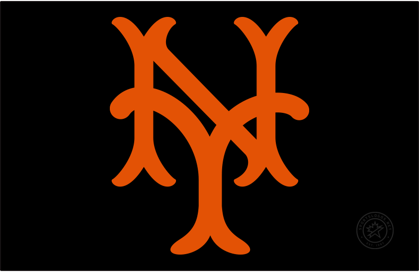
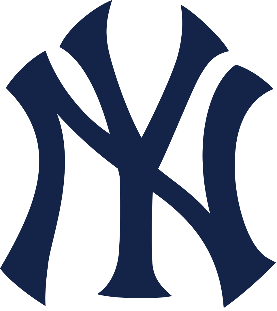
Since I was a a die-hard fan of the baseball New York Giants before they moved to San Francisco, the inter-locking orange NY on their black caps was a magical sight for me. Of course, the New York Yankees version of that emblem is the most famous by far, and along with their home pinstripe uniforms, are baseball’s lasting team symbol.
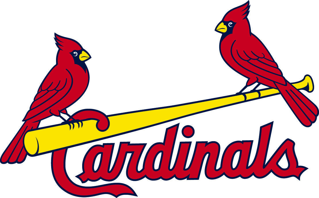
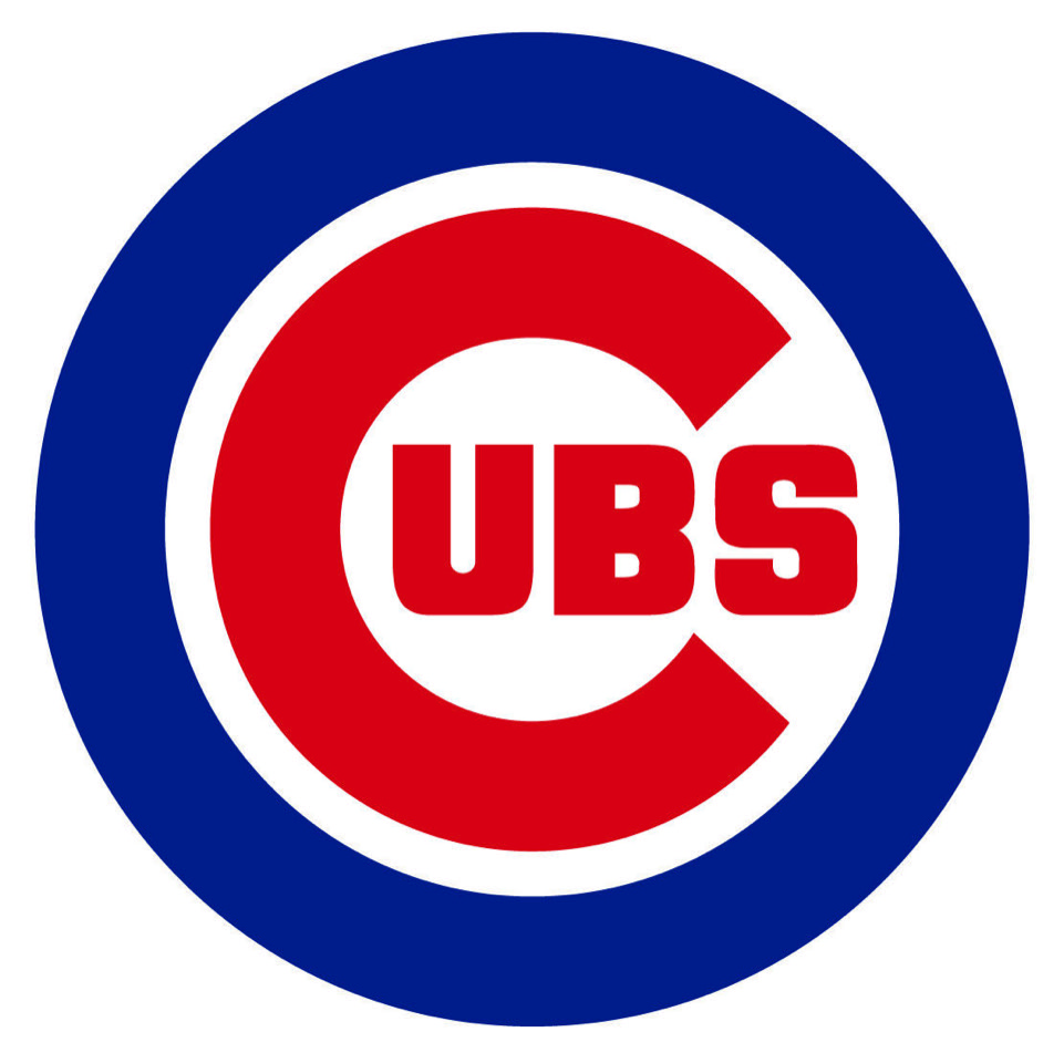
The other baseball emblems that are the most recognizable belong to the Chicago Cubs, Philadelphia Phillies, and St.Louis Cardinals.
The best are the Cardinals lettering with a gold bat across the front with a pair of cardinal birds perched at each end.
The Cubs have relied on that circle, with the large “C” enveloping the rest of the team name.
I adored the Phillies script with two little stars dotting the i’s.
There are so many others, of course, like the script lettering on Dodgers uniforms, the wishbone “C” encapsulating the name Reds, similar to the Cubs style, and the Braves, with the tomahawk under the name.
So many teams, and so many of the new designs, but I’d rather stick to the originals which are the traditional ones I first knew.
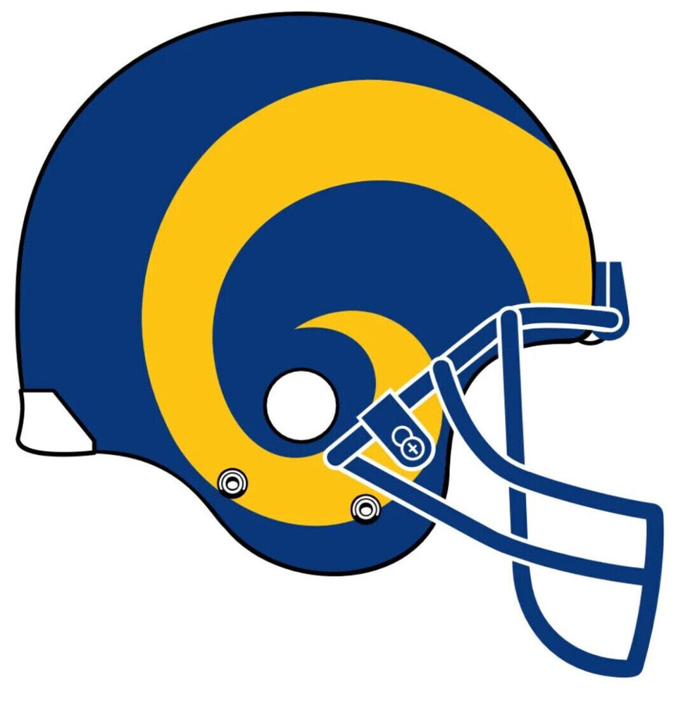
Today, every NFL team wears helmets with a logo, but other than an occasional stripe down the middle, all clubs but one were unadorned for decades.
That one team was the Los Angeles Rams, who were the first pro football team to team to display a logo on its helmet and it was a beauty.
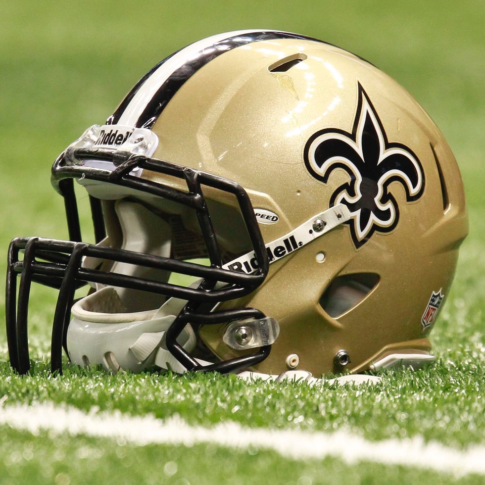
If I were to close my eyes in the sea of all of the NFL teams and visualize the logos that still impress me, I would see the fleur-de-lis of the New Orleans Saints, the horseshoe of the Baltimore, now Indianapolis Colts, and perhaps the lone star of the Dallas Cowboys and the famed “G” of the Green Bay Packers.
There are three teams with logos that bring a smile from the National Hockey League, and they all come from the original six.
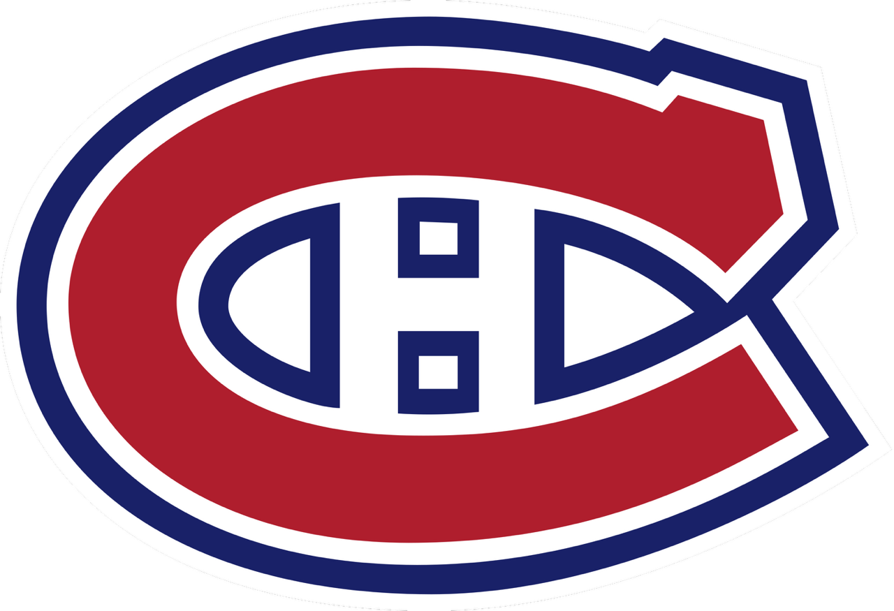
The “CH” of the Montreal Canadiens that have never been altered on their familiar jersey leads the pack. Over the years, many have questioned what the “H” represented. There have been two answers but only one true one. Some claimed it stood for “Habitants”, or Habs as they were referred to often. But the real meaning of the “H” is simply “hockey”.
Le Club de hockey Canadien are the Montreal Canadiens.
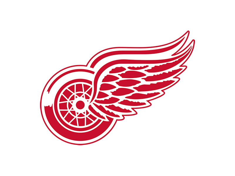
Much easier to explain are the Toronto Maple Leafs. More stylish but equally traditional is the winged-wheel of the Detroit Red Wings, and the Hub of the Boston Bruins.
In the NBA there have been so many logos and designs representing the teams, but there is one that I thought stood out above the others.
It was clever and descriptive in my opinion of a logo that best expressed the city in which the team played. Once upon a time there was a team, the Philadelphia Warriors who picked up and moved to San Francisco.
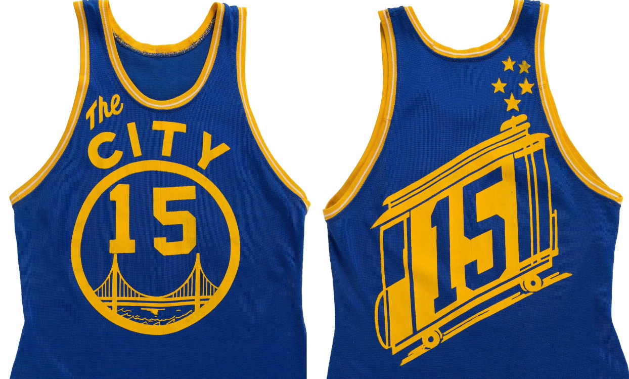
Later on, the Syracuse Nats became the Philadelphia 76ers, but this is about the team from the Bay Area. On the front of the jersey, it never indicated San Francisco or Warriors, merely “The City”. It was a circle with a number and the Golden Gate Bridge. On the back was the players number inside a cable car going halfway to the stars as Tony Bennett crooned. I don’t believe there has ever been a design more creative.
I will end with that one because pictures are better than words in this case.
The subject may not have been as cultural as Rollin Hansen would have preferred, but it does make a statement as to the value of those wonderful graphic artists who have made a team name come alive, and stay alive for the followers of those teams for centuries.

